Showing posts with label indian skin tone. Show all posts

Friday, 21 September 2012

Sleek blushes: Sunrise and Honour

Since my Year 12 formal in 2009, I have been trying to find a blush similar to the one used by the MUA who did my make up for that night. Here is a (bad) photo -


The reason I didn't ask her on the day is you can probably see my fail eye make up! I asked for a smokey eye to go with my black dress and ended up with glittery eye lids, leading to glitter all over my face. And racoon-like eyeliner. I didn't have the time to fix my eyes properly as I was trying to get glitter off my face! Anyway, you can see that the blush is a brown-bronze colour.

I've tried a few that I thought would be close. MAC - Margin, which is a great blush but it was a bit too bronze. I also tried E.l.f - Berry Merry but it was too plum like.

This is what led me to buy two Sleek blushes, Sunrise and Honour (a limited edition blush from the 2012 Collection). From browsing through swatches, they appeared quite similar, so I thought why not buy both and see if either of them happened to be similar to that blush I've been trying to find.


Sunrise on the left and Honour on the right.


Sunrise on the left and Honour on the right. It's hard to explain the difference but Honour is a deeper and more brown. The lids are a bit difficult to open but the cases are sturdy - when trying to open Sunrise, I dropped it onto the floor (floorboards, mind you) and I was expecting the blush to break but it didn't! 


Swatched on my hand (ignore the veins) - Sunrise on the left, Honour on the right.


Same as above, swatches in sunlight. I think this is where you can really see the difference. Honour looks more bronzey-gold-browny. Hey, wasn't that the type of blush I was searching for...


Both of the pictures above are Sunrise. It comes out like a nice flushed colour. This blush is REALLY pigmented so go easy! The first time I tried, it looked like I had been punched in the face. 


Moving on, this is Honour. In the sun, it certainly manages to show off. I should mention that Honour is 7.2g whereas Sunrise is 8g.


Both the pictures above are Honour. This one is more brown that Sunrise and I think it looks quite similar to the blush I was wearing for my Year 12 formal. What do you think?

Either way, I'm really glad I purchased both!

What are your thoughts on Sleek blushes?

Monday, 17 September 2012

Experiments with lipsticks of the wrong shade (for me)

If you're anything like me, a large percentage of your beauty buys are either online or inspired by something you've seen online. I have fallen victim to buying quite a few things online and they turn out to be awful for me. Lipsticks seem to be a particular issue for me, so I have a bunch of them sitting around doing nothing but collecting dust! 

Today I thought I would try to mix them with other lipsticks to see if I could make these shades more wearable.


First up is NYX Round Lipstick in Tea Rose. I bought this one online after having a look at a few swatches. It's a shame the colour doesn't work for me because I really like the creamy consistency. I expected it to be a bit more peachy pink but it is more pink than anything else.


Yikes. You can probably see why I can't/don't wear this! Bubblegum pink doesn't suit my skin tone. That, and I don't have the confidence to pull off crazy shades anyway.


So I have tried to mix this with a darker colour to make it a darker berry pink, something I am more comfortable with. I have added Rimmel Lasting Finish in Temptation. I don't use this Rimmel one much either, it's a nice red but probably too blue toned for me. Mixing them together produces a deeper pink.


Sorry about the blurry photo! But the main thing here is just that this pink is a bit more in my comfort zone. This colour is something I'm much more likely to wear.


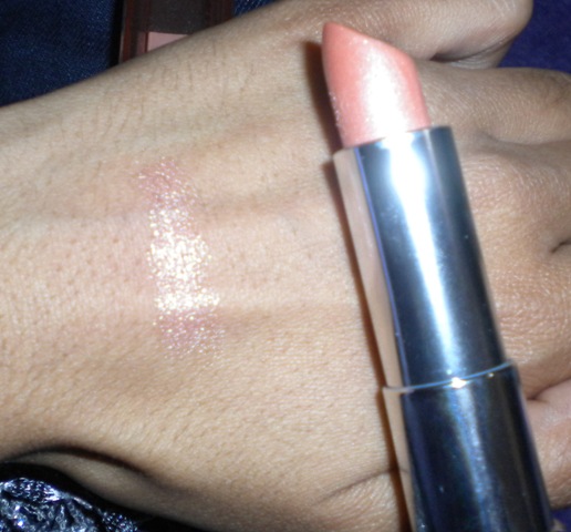
Alright, moving on. This one is Maybelline Colour Sensational Lipstick in Coral Desire. The lipstick itself is a gorgeous pale coral but when swatched - what?! Where did the colour go?! 


Yes I smeared my lips in vanilla frosting here. No, not really, but that is how Coral Desire turns out. I don't fancy wearing white frost on my lips, to be honest.


Again, I have mixed it with another lipstick that I don't use too much. I have added Revlon Colorburst Lipstick in Sienna, a chocolate brown. This translates to a bronzey shimmer.


I actually really like this combination. It is something I can definitely wear and not be paranoid that I have alien lips.


What are your thoughts on mixing lipstick shades? Do you do it too?


Monday, 10 September 2012

Revlon Colorburst 'Rosy Nude' dupe

I know that Revlon isn't one of the typical high end brands that you would want a dupe for, but I noticed a striking similarity between one of their Colorburst lipsticks and a lower end one by Ulta3, an Australian brand (you may have come across their nail polish at various chemists).

Revlon Colorburst lipsticks RRP - $23.95 (or you can cheat like me and buy them online)

Ulta3 Moisturising Lipstick RRP - $2.95

...I think you can see why I thought this was worth posting about!


Comparison of packaging of Revlon Colorburst and Ulta3. I won't lie, the case for Ulta3 does it no favours. It is quite flimsy and very light weight, doesn't feel or look as nice as the Revlon one. But for less than the cost of a coffee, we can let that slide.


Swatches - which is which?! First have a guess. On the left is Ulta3 - Tawny Pink and on the right Revlon Colorburst in Rosy Nude. One swipe each, both pretty pigmented and they look quite similar! Rosy Nude is probably a bit more pink I would say.


From the picture above, you can see they are quite similar. I'll just add that the consistency of the lipsticks are different, Ulta3 is more like lipbalm/lipstick as it is quite creamy. It also has the wear of a lip balm. Revlon Colorburst is a bit thicker like the traditional lipstick and is longer wearing. You can probably see above that Ulta3 is more shiny too (as it is a 'moisturising' lipstick). 


Saturday, 8 September 2012

Does Naked 2 work for warmer skin tones?

Not as much as the original Urban Decay Naked palette.

I'm not saying that it doesn't work at all, but the original Urban Decay Naked palette is probably better suited for warmer/darker skin tones in my opinion.

I have done some swatches of Naked 2 to illustrate my point...


Here it is! I do love the packaging of it. Urban Decay never fails to impress. Oh, and if you're wondering what nail polish I'm wearing, it's 'Come to Bed Red' by Butter London.


And this is what the inside looks. The mirror is much larger and more practical than the one of the original Naked. Something I've noticed (other bloggers have mentioned it too) is that because of the big mirror, the palette doesn't always sit flat! The weight of the mirror pulls it back. Anyway, I like the double ended brush - the fluffy end I use for blending and the flat end for applying colour. 


Swatches in light - this doesn't really sell the palette does it? You can see that the first half of the palette are the lighter shades.


This picture probably does the palette more justice. Again, the first few shades don't show up that well but there are some really gorgeous colours here. Chopper, the rose gold and YDK are my favourites. Foxy and Bootycall can be used as highlight colours. Tease is what I use as a crease/transition colour, and I use either Busted and/or Blackout for deepening the outer corner of my eye. 

I was actually quite surprised when I did these swatches, the colours are more of a cooler tone. 


This is a look I have done using Naked2. I've used Busted (the purple) for the outer corners and chopper for the lid colour, Foxy as the inner colour and highlight.

If you want to see swatches of the original Naked palette against my skin, please have a look at my post comparing MUA undressed and Naked.


http://allherprettylittlethings.blogspot.com.au/2012/08/mua-undressed-naked-palette-dupe.html


Thanks for reading :)


Friday, 7 September 2012

Revlon Colorburst Lipsticks - the quest for my neutral shade


I have been searching for quite some time for a shade that is similar to my lips. I'm not using the term 'nude' because to me that means something like the typical skin tone shade, so I'll say 'neutral', as my skin is a little darker. 


Searching through some blogs, I came across two Revlon Colorburst lipsticks that could potentially fulfil this role - Soft Rose (#40) and Rosy Nude (#65).


How adorable is the case! The quilted front makes this packaging a favourite for me across lipsticks.


Left: Soft Rose 
Right: Rosy Nude

The difference is hard to spot here, but Rosy Nude is more brown whereas Soft Rose is pink.


Left: Soft Rose
Right: Rosy Nude


No flash. You can see Soft Rose has more of a pink tone, and again, Rosy Nude appears more brown. These lipsticks are very pigmented! You definitely get bang for your buck here. 


And here is a side-by-side comparison on my lips (both taken with flash). Again, you can see Soft Rose is a warm pink with Rosy Nude being less so and more 'neutral'.
If you've used Revlon Colorburst, you'll know that the formula is deliciously creamy and easily buildable. I can't think of any negatives, except for the fact that they're so good I want to buy lots and make myself poor. 

Conclusion: They're both gorgeous colours, but for the purpose of this quest - Rosy Nude wins as being the more neutral, every day lip colour!

Related Posts Plugin for WordPress, Blogger...